Skip to content
WorkArchiveAboutContact

Shortcuts

  • WWork
  • CContact
  • TLight or dark
  • 8Random featured project
  • ?This sheet
  • Work
  • Archive
  • About
  • Blog
  • Contact

Email

hello@elysiumdesigns.in

Book a call

Social

  • LinkedIn
  • Dribbble
  • Behance
  • Threads
Bengaluru
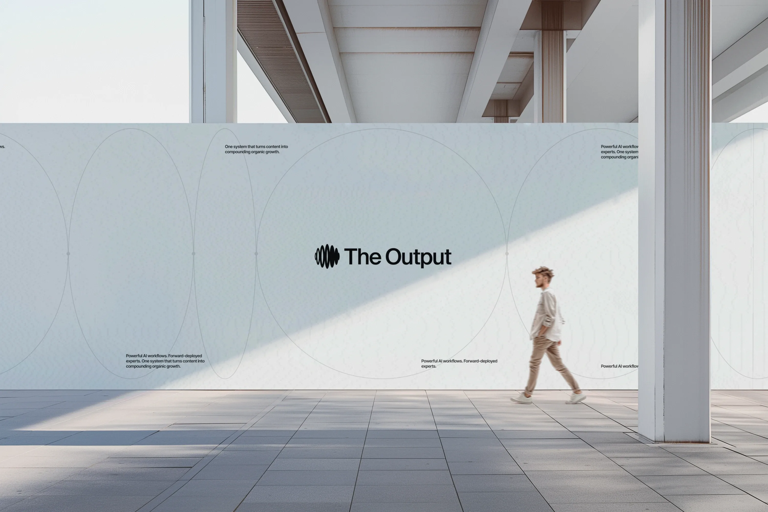
←Work

The Output brand identity · website design

MediaPublication27 / 27
Client
The Output
Category
Independent growth publication · Newsletter
Scope
Brand identity, website design, development
Year
2025

Startup content is mostly noise. The Output turns messy experiments in growth, content and AI into clear stories founders can use by Monday, and it needed a brand that looked as sharp as its thinking.

We built a symbol from signal flow and data noise, an editorial type system that lets ideas land, and a website that puts the writing first.

A brand, website and production build for an independent publication that helps builders go from zero audience to dependable demand.

ParloaPrevParloaHighflyersNextHighflyers
Get in touch
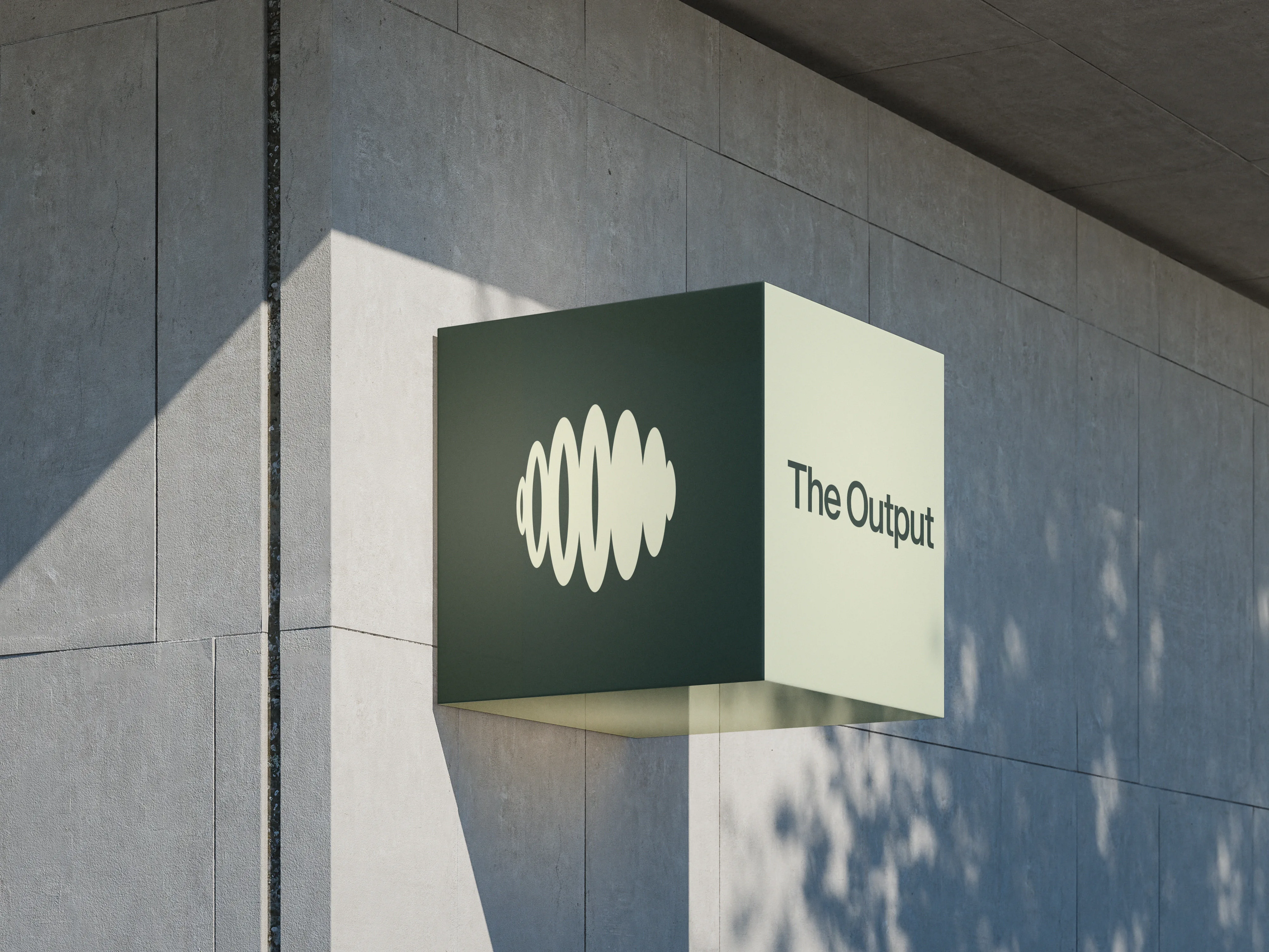
  • A green and cream cube sign with The Output symbol on a pale concrete wall in sunlightA green and cream cube sign with The Output
  • The Output: Brand stationery on a tableBrand stationery on a table
  • A dark tote bag printed with fine contour linesA dark tote bag printed with fine contour
  • A person walking past a large pale wall carrying The Output logoA person walking past a large pale wall
  • A green and cream cube sign with The Output symbol on a pale concrete wall in sunlightA green and cream cube sign with The Output
  • Brand stationery on a table: a dark folder, letterhead and cards with the wave patternBrand stationery on a table
  • A dark tote bag printed with fine contour linesA dark tote bag printed with fine contour
  • A person walking past a large pale wall carrying The Output logoA person walking past a large pale wall
  1. A green and cream cube sign with The Output symbol on a pale concrete wall in sunlight
    A green and cream cube sign with The Output
  2. 01 · The challenge

    A newsletter has no product to hold, so the brand and the reading experience are the product.

    The Output is an independent, irreverent playbook for people building companies. It distils messy experiments in growth, content and AI into crisp, evidence-packed stories that founders and marketing leaders can use on Monday morning.

  3. 02 · Strategy

    Field notes, not noise

    The idea behind the brand is the idea behind the writing: take raw thought and make it meaningful. The identity had to show that transformation, from noise to signal, without turning into a metaphor nobody needed.

    Brand ideaBuilt for Monday, not someday.

  4. The line 'Built for Monday
  5. 03 · Identity

    A symbol that turns noise into a wave

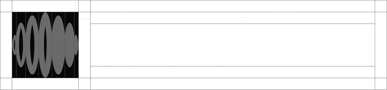
    The symbol draws on signal flow and data noise: stacked ellipses that swell into a waveform.

  6. The Output symbol: black ellipses forming a waveform
    The Output symbol
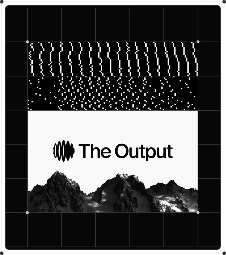
  7. The Output logo and wordmark on a construction grid
    The Output logo and wordmark on a
  8. The cream waveform symbol appearing on a
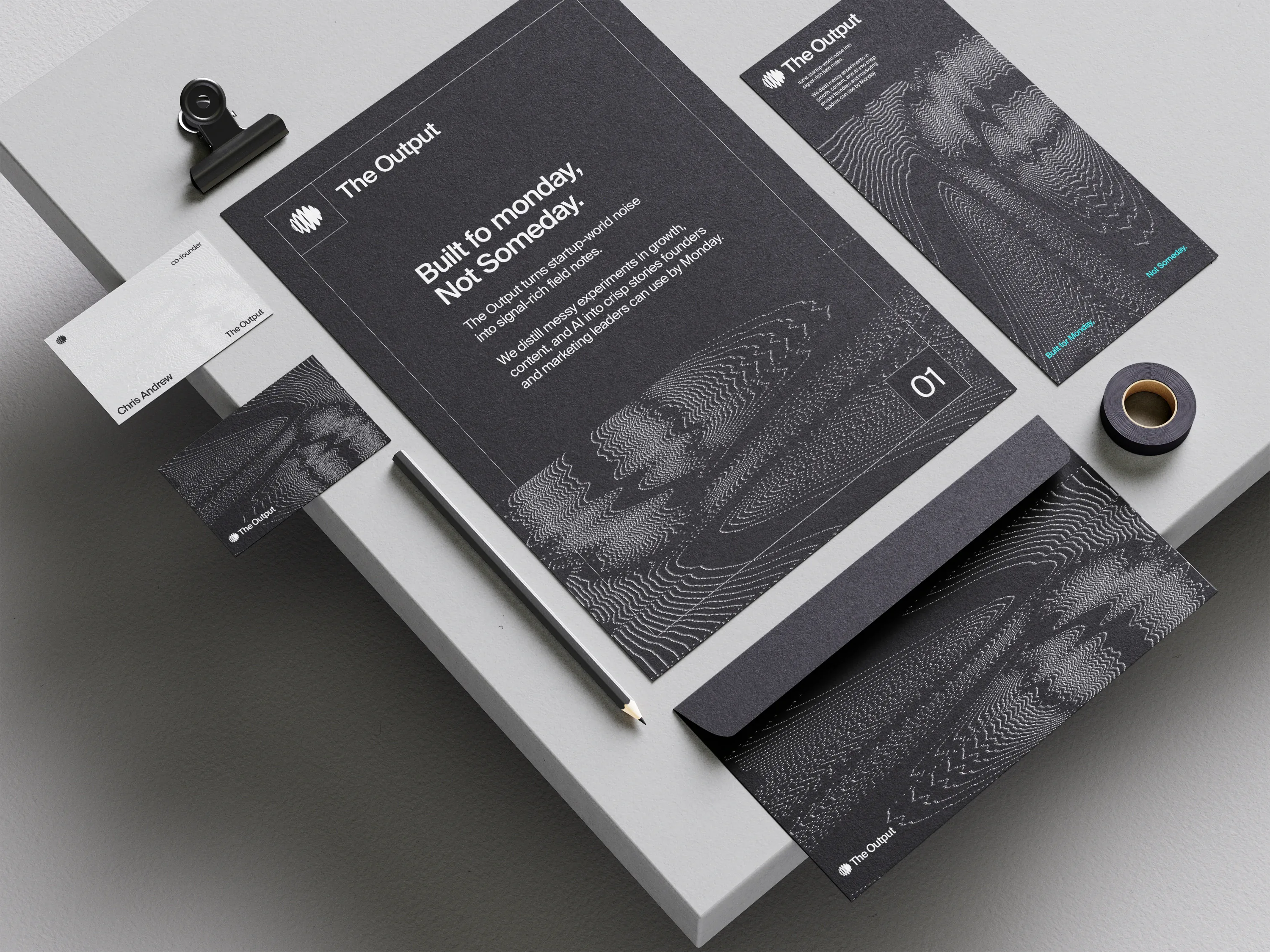
  9. Brand stationery on a table: a dark folder, letterhead and cards with the wave pattern
    Brand stationery on a table
  10. A brand board: wave patterns above the logo on white and a black mountain
    A brand board
  11. 04 · Imagery

    Signal, drawn in dots and lines

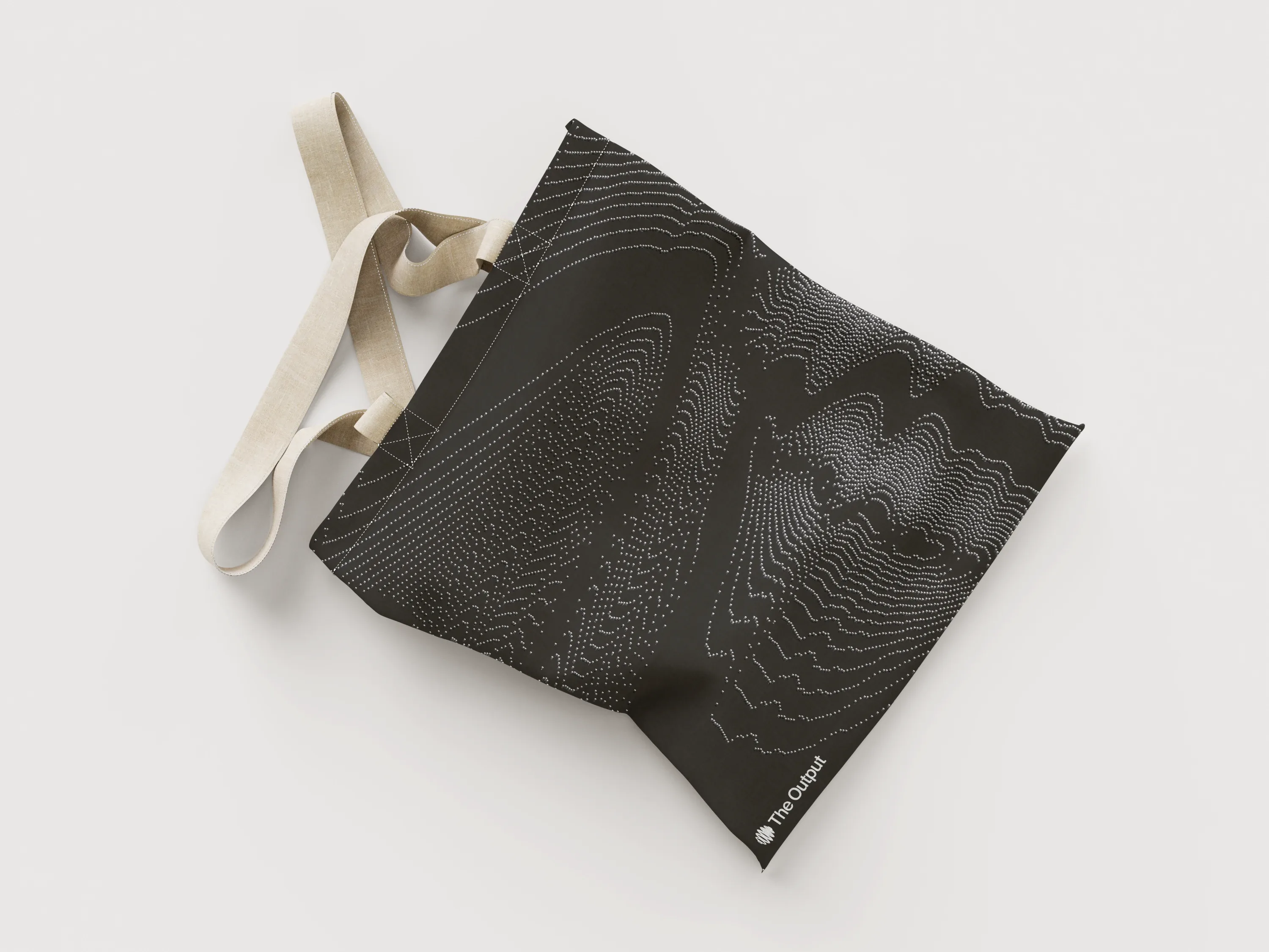
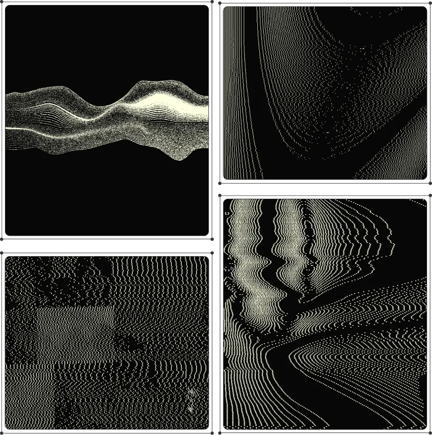
    Imagery and illustration follow the same idea: contour lines, stippled waves and pixel patterns that are visually iconic and quietly suggestive of data. They give the publication a recognisable texture without leaning on stock photography.

  12. A field of white dots rippling into
  13. A dark tote bag printed with fine contour lines
    A dark tote bag printed with fine contour
  14. Four contour and wave illustrations in black and cream
    Four contour and wave illustrations in
  15. Four pixel-pattern tiles
  16. 05 · Typography

    Editorial type that lets ideas land

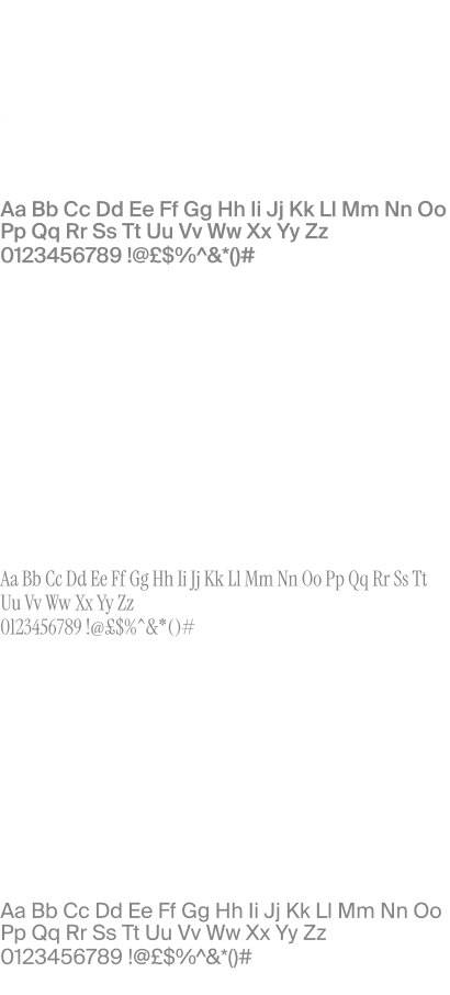
    For a publication, type is the main interface. We paired Suisse Int'l with Instrument Serif in an editorial system that balances sharpness with space and structure with spontaneity.
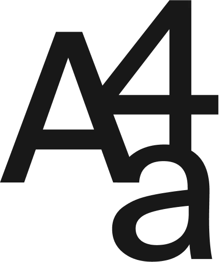
  17. A large 'Aa' specimen in black
    A large 'Aa' specimen in black
  18. Type specimens: Suisse Int'l and Instrument Serif
    Type specimens
  19. 06 · Website

    A site that puts the writing first

    The website is where the playbook lives: 'Charting the messy middle of growth', with feature stories, author portraits and clear ways to subscribe.

  20. The Output homepage scrolling
  21. A card 'Built for Builders
  22. A person walking past a large pale wall carrying The Output logo
    A person walking past a large pale wall
  23. 07 · Impact & proof

    What this means if your product is ideas

    50,000+Executive and founder readers subscribed

    4 minsAverage reader dwell time per deep dive

    100%Custom responsive editorial design system

    When the product is writing, the brand should get out of its way.

  24. 08 · Deliverables

    Brand

    Strategy and essence, Symbol and wordmark

    Type

    Typography and hierarchy

    Website

    Website design, Development

ParloaPrevParloaHighflyersNextHighflyers
Get in touch
Start a project like this ↗

Other projects (26)

  • Highflyers
  • Rippl
  • OpenCoreOS
  • Quper
  • Coris
  • Sprinto
  • Demostack
  • Docket
  • Simplismart
  • Publion
  • Breakout AI
  • Ona
  • Embody
  • Passkeys
  • Grateful
  • Orbital
  • Out of Dark
  • OVB
  • BCB Cloud
  • vIntelligence
  • VP
  • Unraven
  • Payop
  • Compound
  • Kedalion
  • Parloa
Elysium Designs studio desk at night with a notebook and pen

Start a project.

Get in touch↗
Send a brief↗Book a callInstagram↗

Email

hello@elysiumdesigns.in

Contact form↗

Social

  • LinkedIn
  • Dribbble
  • Behance
  • Threads

Studio

  • Bengaluru--:--

Available for new projects

More

  • Contact
  • Blog
  • Pricing
  • Our products
© 2026 Elysium DesignsDesigned to Be Remembered.
Elysium Designs
Elysium Designs23 / 23 HIGHFLYERSBLR --:--