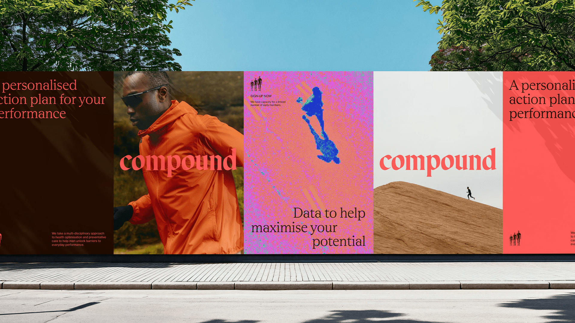
Compound posters along a street wall 01 · The challenge
Men's health is a category that talks down or shouts. Compound wanted to be insightfully honest.
Compound is an integrated, personalised healthcare program from Australian digital healthcare company Eucalyptus.
02 · Strategy
Workshops first
We worked with Eucalyptus's leaders and Compound's program heads through workshops, interviews and hands-on experience of the diagnostics.
Brand ideaTo the power of.
03 · Naming
A name that is also the strategy
We wanted the name to connect truth and strategy, so we ran the naming and strategy work streams together as a feedback loop.
- 01Insightfully honest
- 02Own the struggle
- 03Consistency compounds
04 · Brand system
Old and new, gothic and digital
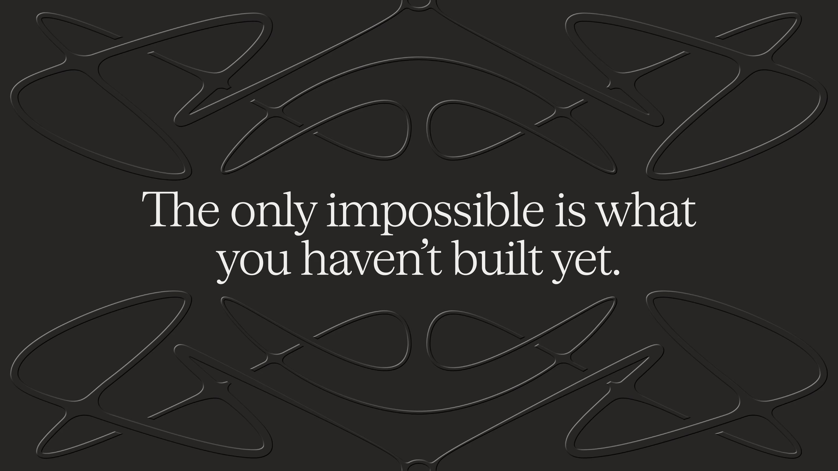
At the heart of the brand are the wordmark and icon, drawn between gothic letterforms and pixels. Old and new together suggest the truth of the analytics and the ambition to build a better you.
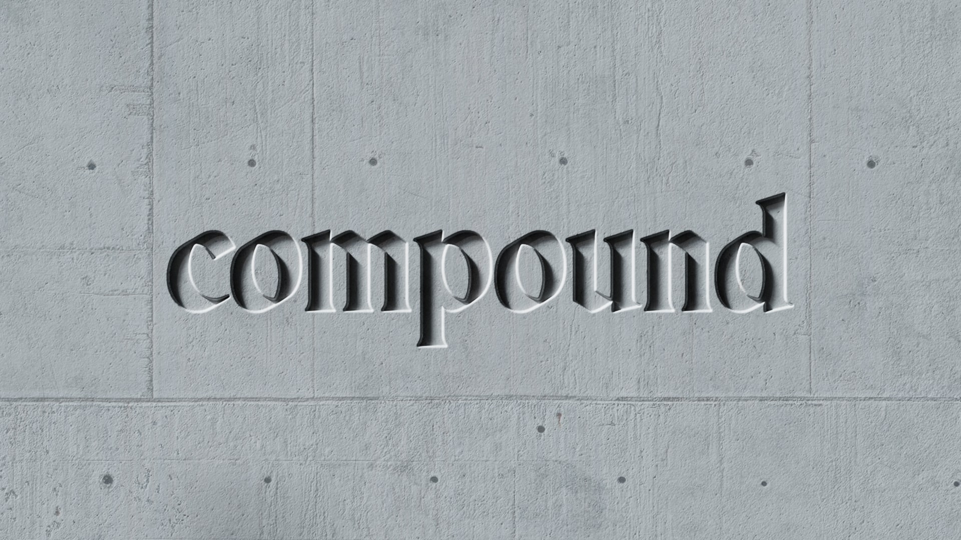
The Compound wordmark embossed into a 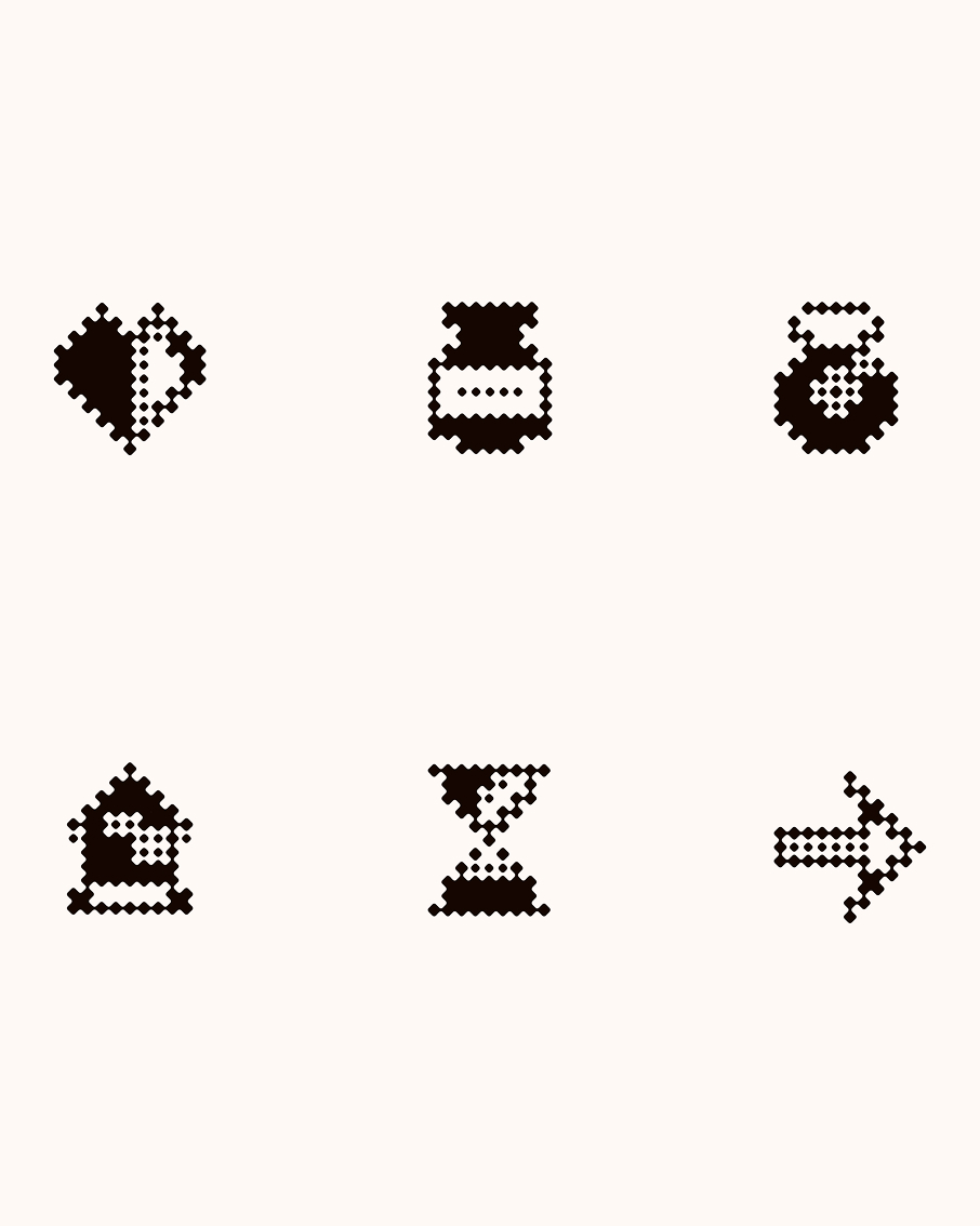
A set of pixel-art icons 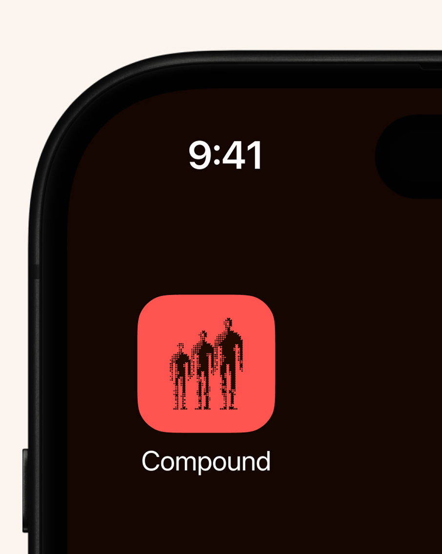
A phone home screen with the Compound app Your name, in your own hand
As a program with a passionate cohort, the brand gives clients a place in it.
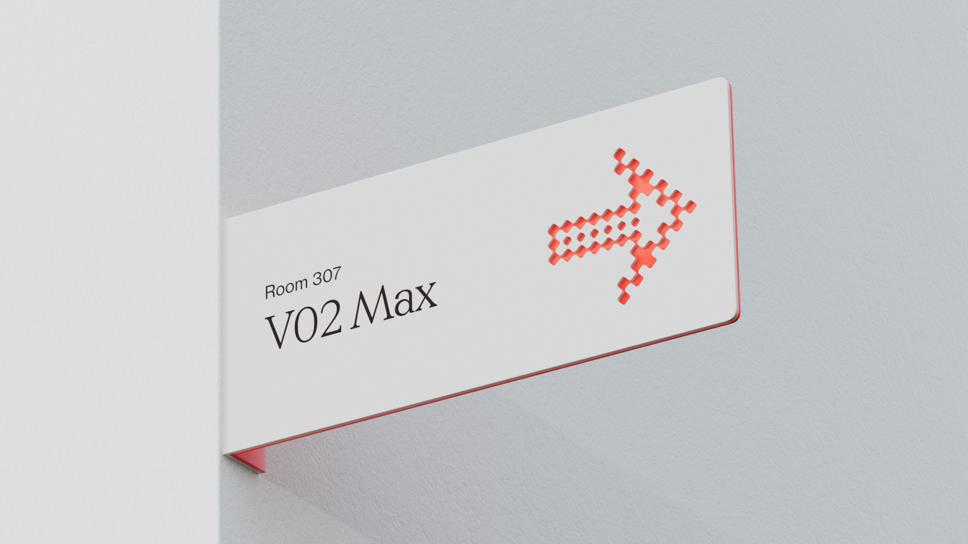
A white clinic sign reading 'Room 307 V02 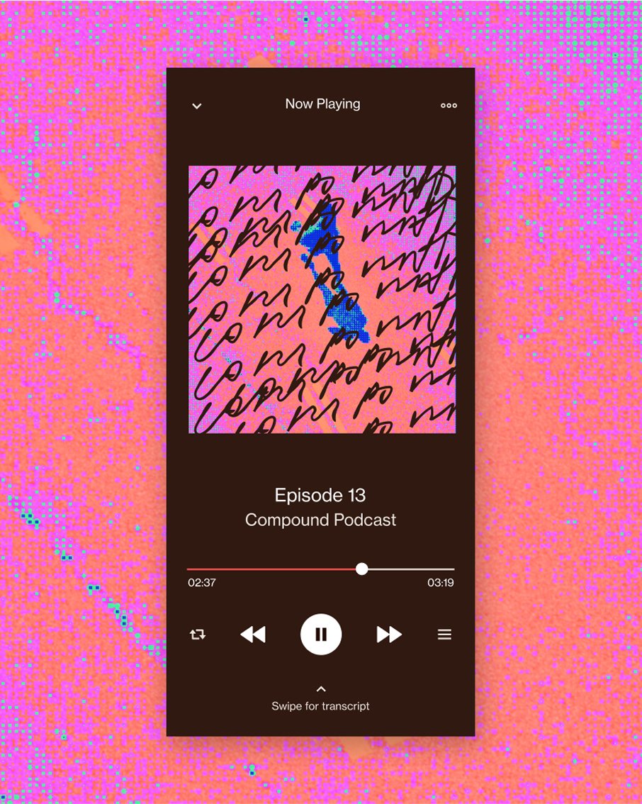
A podcast player in hot pink and orange 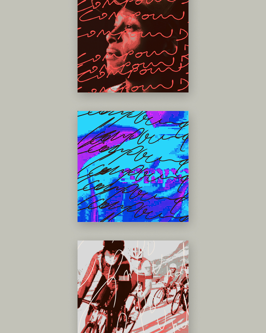
Three podcast cover tiles in red 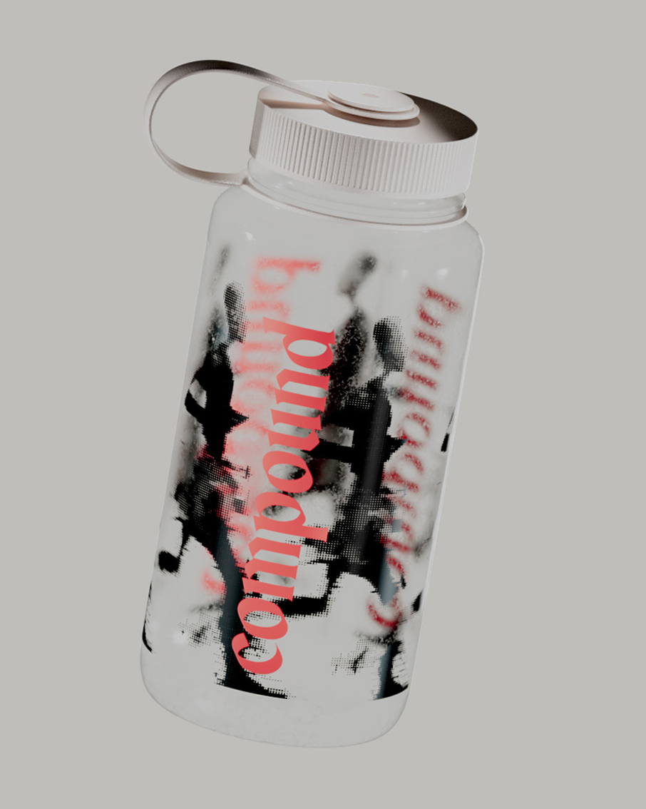
A clear water bottle printed with red 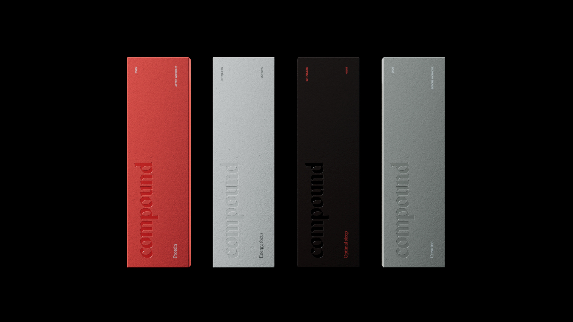
Four supplement boxes in coral 06 · Impact & proof
What this means if you're launching in a crowded category
100%Waitlist capacity filled in private beta
50+Personalized biomarker protocols mapped
1 sprintFull naming, brand & app system delivery
A brand stands out when its idea is true to the product.
07 · Deliverables
Strategy
Workshops and interviews, Brand idea and values
Naming
Name, Tagline: to the power of
Identity
Wordmark and icon, Typography
Applied
App icon, Podcast covers
Shortcuts
- WWork
- CContact
- TLight or dark
- 8Random featured project
- ?This sheet