B2B SaaS Landing Page Best Practices That Convert
In short
- A B2B SaaS landing page has one job: convert a specific, targeted audience arriving with specific intent, unlike a homepage that has to serve everyone.
- The pages that convert best share a predictable structure - a headline that matches what the visitor was promised, proof early, one CTA repeated consistently, and objection-handling before the ask.
- This post breaks that structure down section by section.
Contents (10)
Landing Page vs. Homepage
A landing page is built for one specific audience and one specific offer, usually receiving traffic from a single source (an ad, an email campaign, a specific search query) where you know exactly what the visitor was promised before they arrived. A homepage has to serve many different audiences and intents at once, which is why it's structured more broadly.
The most common landing page mistake is treating it like a mini-homepage - covering every product feature and audience instead of speaking directly to the one visitor type it was built for. A landing page should feel like it was written specifically for the person who clicked the ad or link that led them there.
Anatomy of a High-Converting Page
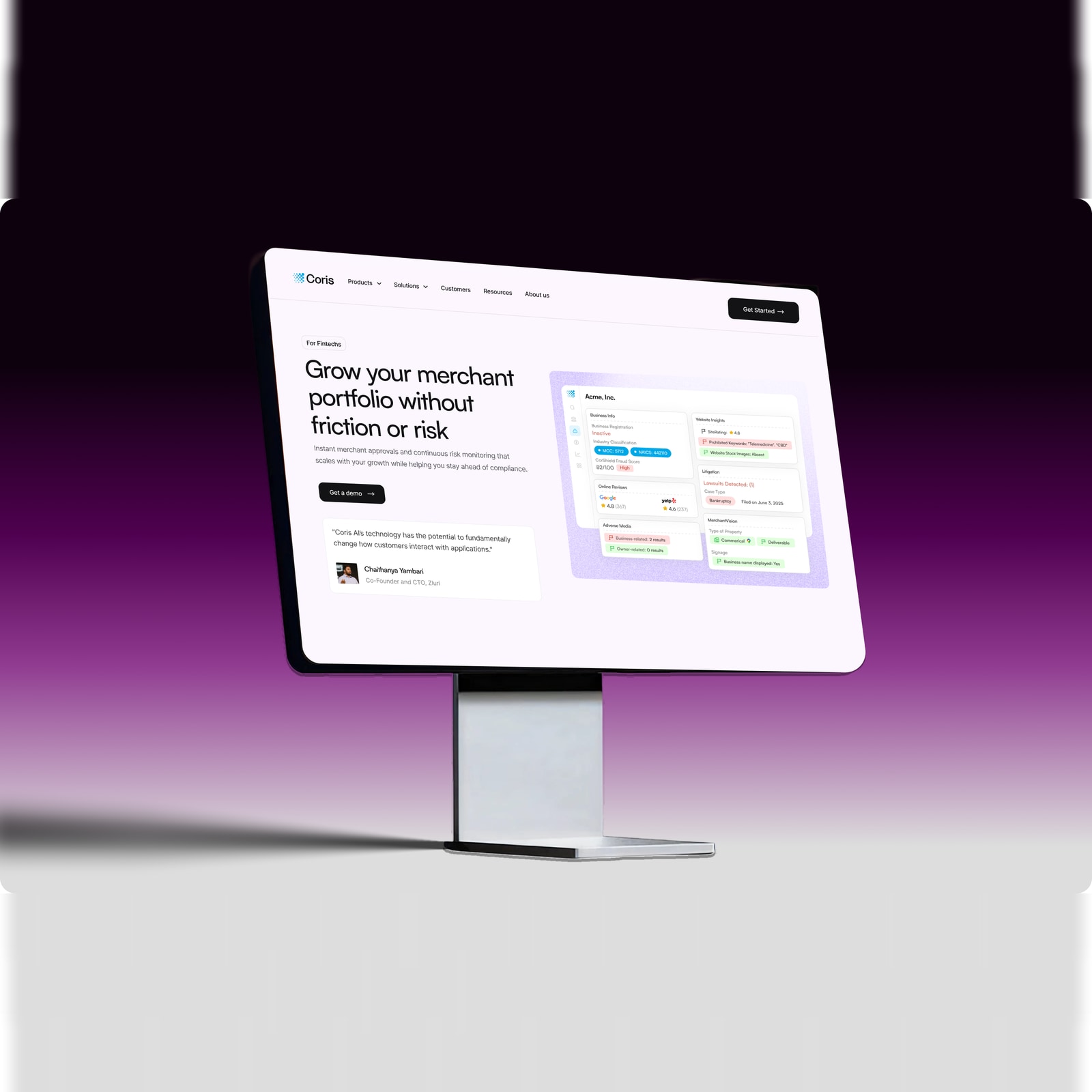
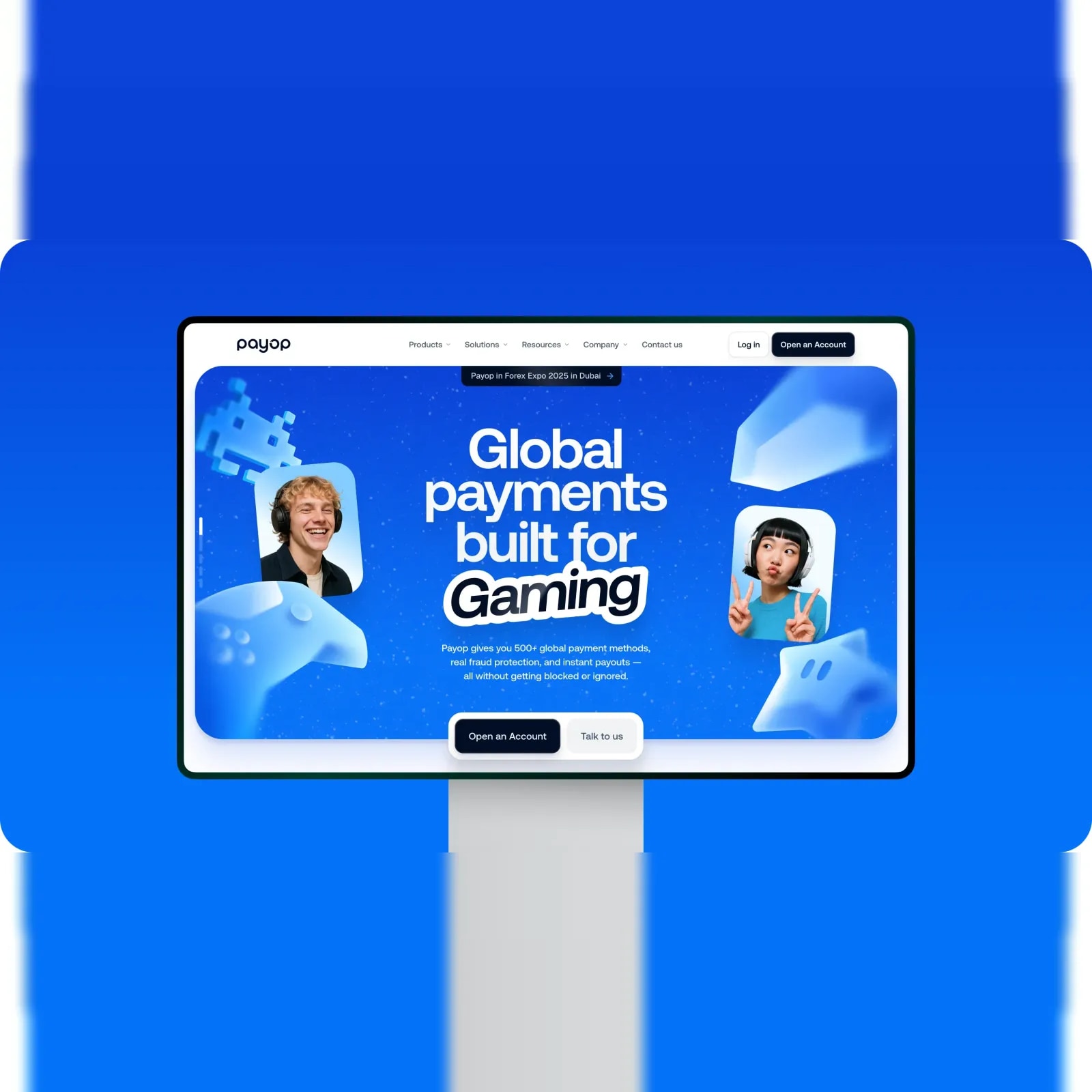
- Hero - headline that matches the promise of the ad or link that brought the visitor here, with one clear CTA.
- Proof - logos, numbers, or a credibility signal immediately after the hero.
- Problem/solution framing - names the specific pain point this audience has, then positions the product as the fix.
- Product in action - screenshots or a short demo showing the product doing the thing it promises, not just describing it.
- Objection handling - addresses the specific hesitations this audience is likely to have (integration effort, security, pricing).
- Deeper proof - a case study or detailed testimonial relevant to this specific audience segment.
- Final CTA - restates the offer clearly, with minimal friction to act.
Hero Section Patterns
The strongest B2B SaaS hero headlines state a specific outcome for a specific audience, not a vague value proposition - "Cut support ticket volume by automating tier-1 responses" reads stronger to a support team lead than "AI-powered customer experience platform." Match the headline language to the language the visitor used to find you, whether that's the ad copy they clicked or the search query that led them to the page.
Keep the hero CTA singular and specific - "Start Free Trial" or "Book a Demo," not both competing for attention in the same view.
Proof and Trust Sections
Place your strongest proof - client logos, a specific metric, a notable case study - as close to the hero as possible, since B2B buyers are evaluating credibility before they read anything else on the page. Generic testimonials ("Great product!") do little; specific ones with a name, role, company, and a concrete result do the actual convincing work. If you have real usage numbers, security certifications, or integration partners relevant to a skeptical B2B buyer, surface them prominently rather than burying them in a footer.
CTA Placement and Frequency
Repeat the same CTA at natural stopping points down the page (after the hero, after proof, at the end) rather than only once at the top - not every visitor converts on first sight, and repeated, consistent CTAs catch visitors at different points in their read. Keep the CTA language identical throughout the page; switching between "Start Free Trial," "Get Started," and "Try It Now" on the same page adds confusion where none is needed.
Common Landing Page Mistakes
- Generic messaging - hero copy that could apply to any SaaS product, not specifically yours.
- Multiple competing CTAs - asking visitors to choose between a demo, a trial, and a newsletter signup in the same view.
- Feature-dumping - listing every capability instead of the 2-3 that matter most to this specific audience.
- No social proof above the fold - making a skeptical B2B visitor scroll to find any credibility signal.
- Slow load times - heavy hero animations or unoptimized images that delay the page before the offer is even visible.
What to Test First
If you're starting to run structured tests on a landing page, prioritize in this order: headline clarity first (it has the largest impact on whether visitors read further at all), CTA copy and placement second, and proof/testimonial content third. Layout and visual polish matter, but they typically move conversion less than getting the message-to-audience match right in the first place - see our related post on what makes a website convert for the broader conversion fundamentals this builds on.
Conclusion
A B2B SaaS landing page converts when it speaks to one specific audience with one specific offer, proves credibility early, and removes friction between interest and action. Match your headline to what you promised, keep your CTA singular and consistent, and handle objections before the ask, not after.
If you're building or improving a landing page and want a second opinion on the structure, book a call with Elysium Designs.
How Elysium Designs can help
Elysium Designs is an independent, senior-led studio in Bengaluru, India that works with startups and growth companies worldwide. If this article describes a problem you have right now, our website design service is built to solve it. Websites are fixed-price: a Landing site from $5,000 (2-3 weeks) and a Flagship site from $16,000 (6-10 weeks), with conversion structure and SEO built in from day one.
You get a fixed price and timeline in writing before work starts, a small senior team instead of a handoff chain, and full ownership of every file. Book a 30-minute call and we will tell you honestly what you need, including when the answer is something smaller than you planned.
Straight answers
What's the difference between a landing page and a homepage?
A landing page is built for one specific audience and one specific offer, usually receiving traffic from a single source where you know exactly what the visitor was promised before they arrived. A homepage has to serve many different audiences and intents at once, which is why it's structured more broadly.
What sections should a high-converting B2B SaaS landing page include?
Seven, in order: a hero with a headline matching the ad or link that brought the visitor and one clear CTA, proof right after, problem/solution framing, product in action, objection handling, deeper proof like a case study, and a final CTA that restates the offer with minimal friction.
What makes a strong B2B SaaS hero headline?
The strongest headlines state a specific outcome for a specific audience rather than a vague value proposition, matching the language the visitor used to find you. Keep the hero CTA singular and specific, such as 'Start Free Trial' or 'Book a Demo,' not both competing for attention.
How often should the CTA repeat on a landing page?
Repeat the same CTA at natural stopping points down the page, such as after the hero, after proof, and at the end, rather than only once at the top. Keep the CTA language identical throughout; switching between different phrasings on the same page adds confusion where none is needed.
What should you test first on a landing page?
Prioritize headline clarity first, since it has the largest impact on whether visitors read further at all, then CTA copy and placement, then proof and testimonial content. Layout and visual polish matter less than getting the message-to-audience match right.
Written by the Elysium Designs team. Elysium Designs is an independent, senior-led design studio in Bengaluru, India that works with startups worldwide.